Garamond’s antithesis —
butt of all jokes and nil finesse
Gail McConnell, “Type Face”, on Comic Sans
In an interview for the BBC TV Culture Show in 2005, the British type designer Matthew Carter told a joke:
Comic Sans walks into a bar. “Sorry,” says the barman, “we don’t serve your type here.”
There are not, Carter admitted, many type design jokes — and jolly, felt-tipped Comic Sans is presumably the punchline of most of them (the “sans”, incidentally, refers to the lack of serifs, or lines, at the ends of each letter stroke).
So I was happy last year to be able to add to the tally with a tweet, albeit one which needs a bit of context. Here‘s the story in 4 parts:
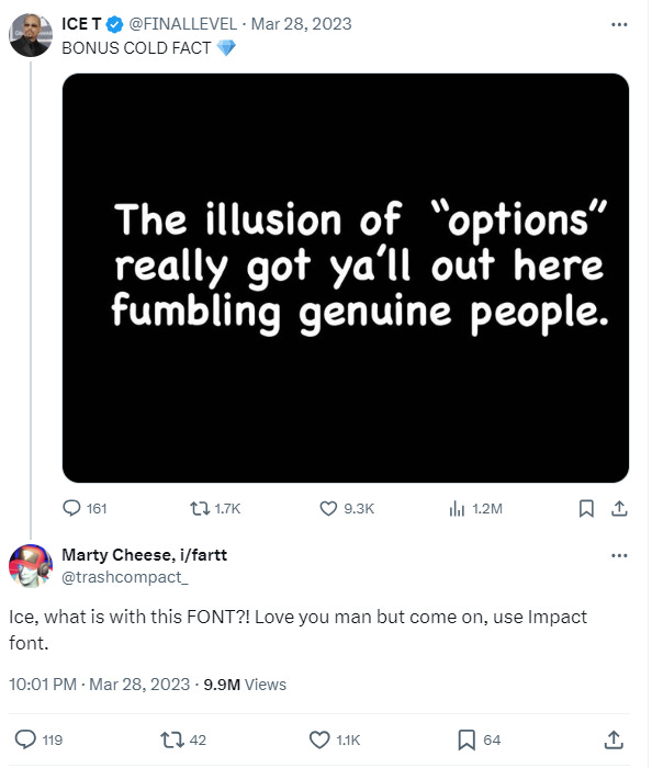
The rapper Ice T tweeted some sound advice about romantic relationships.
An admirer in the replies objected to the mismatch of form and content:
Ice T did not appreciate the feedback:
At which point, I got involved:
Rappers, on the whole, don’t have to worry about page proofs. But poets who publish their work do care about weirdo shit, as I was reminded while reading a new study of W.S. Graham by my University of East Anglia colleague David Nowell Smith.
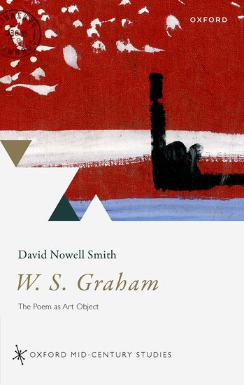
W.S. Graham: The Poem as Art Object (2023), explores the relationship between Graham’s poetry and visual art. In a footnote on the “look” of poems, David comments:
Graham could get quite irritable about the layout of his books, such as when seeing the Faber proofs for Implements in their Places in early 1977. He writes to [Faber poetry editor] Charles Monteith:
The type is all right but the moustache [an ornament the typesetters had added] between the title and the first line of the poem should surely be taken out. The title is part of the poem. And the space between the title and the first line is part of the poem. If I had wanted to put something in that space I would have. / Charles, it is not even successful in the visual sense
before firing off another letter the following day, prefaced with the warning: “This is serious and I speak, I hope, without humour,” then reiterating: “you must know it is bad”.
Below is the start of the page proof, before the moustache was shaved off. The poem below it illustrates Graham’s preoccupation with the physical, visual experience of reading and writing, speaking as though the poet is literally “on the page”:
For words — which grew from thinginess —
have cast their spells in metal dress,
each petalled, feather-light impression
a stay against their distribution
Peter Scupham, “The Old Type Tray”

I once tried setting moveable type by hand, at a local print museum. The occasion was a poetry reading by Denise Riley, for which we decided to print a leaflet as an audience souvenir. We chose the shortest poem Denise offered, the 8-line “After La Rochefoucauld”, and it was still hours of slow work. The poem contains the statement
your eye’s pulled
Clear of metallic thought by the light constancy
Of things, that rest there with you
which, when you’re piecing it together backwards with small blocks of type metal, has a strangely immediate meaning.
This experience has since made me wonder if T.S. Eliot’s lines at the end of Part III of “Burnt Norton”
the world moves
In appetency, on its metalled ways
Of time past and time future
might be shadowed— beyond the meaning of “road metal” or train tracks — by the idea of printed words as “metalled ways”. Part V, after all, begins by picking up the phrase “the world moves” and resetting it, as if correcting a printer’s error:
Words move
For those attuned to it, typography can feel like tradition. Charles Boyle, in his pocket history of his small press, Farthings: CB editions in 113 bites (2023), pays tribute to the late type designer Ron Costley, who worked at Faber and Faber, and whose influence is widespread in British poetry:
Anything I know about design, I owe to him. The brown covers with typographic design, no images, allude to the London Magazine Editions that he designed for Alan Ross in the late 1960s.
Similarly, the poet John Fuller once said that the first issues of Ian Hamilton’s The Review were set in Gill Sans because he thought the magazine was going to be a “reincarnation of Geoffrey Grigson”, who edited the elegant and influential New Verse.
Most poetry readers will know what Simon Armitage means when he writes, in A Vertical Art: Oxford Lectures (2021), of how his appreciation of a particular collection — he gives the example of Douglas Dunn’s Elegies (1985), published when he was 22 — is bound up with the physical memory of reading it:
Whether a poem lay on a verso or a recto; whether the encampment of a stanza occupied the top or middle or bottom of a page; the typographical “accent” of a chosen font, which became almost palaeographic in the mind’s eye.
The most memorable and articulate defence that I know of such things, though, is concerned not with poetry but prose. Here is Milan Kundera in Testaments Betrayed (1995, trans. Linda Asher):
Kafka insisted that his books be printed in very large type. These days that is recalled with the indulgent smile prompted by great men’s whims. Yet nothing about it warrants a smile; Kafka’s wish was justified, logical, serious, related to his aesthetic, or, more specifically, to his way of articulating prose.
An author who divides his text into many short paragraphs will not insist so on large type: a lavishly articulated page can be read rather easily.
By contrast, a text that flows out in an endless paragraph is very much less legible. The eye finds no place to stop or rest, the lines are easily “lost track of.” To be read with pleasure (that is, without eye fatigue), such a text requires relatively large type that makes reading easy and allows one to stop anytime to savour the beauty of the sentences.
I began with a tweet and I’ll end with a tweet:
NOTES
Gail McConnell’s poem “Type Face”, from which I quoted a light-hearted couplet at the top of this post, is an extraordinary piece of writing, well worth a serious read:
https://blackboxmanifold.sites.sheffield.ac.uk/issues/issues-11-20/issue-17/gail-mcconnell
Although Comic Sans is much mocked, it has a perfectly reasonable and thoughtful origin story. Here’s John L. Walters in Fifty Typefaces That Changed the World (2013):
In the 1990s Vinccnt Connare was in-house designer at Microsoft (where his other designs included Trebuchet MS and Webdings). He noticed that the interface for the children’s software package Microsoft Bob has carefully coded comic characters whose speech bubbles “spoke” in Times New Roman. Connare thought that was laughably inappropriate and quickly devised a new font based on comic-book lettering.


I find it interesting looking back at how comparatively shorter many of the full-length poetry collections of, for example, the 1980s and early 1990s were. I'm thinking, for instance, of Carolyn Forche's 'The Country Between Us', published by Cape in 1983, such an influential book with 45 pages of poetry. The poems are placed with a large space above each title. There is so much contemplative space within the volume. Although the print isn't particularly large, it appears quite inky and pointed and imprints itself on the reader. Pages are thicker than nowadays, the book very tactile.
Hello, Jeremy. This is brilliant! You might appreciate this poem from the Irish poet Linda McKenna called "Authorized Version," forthcoming in her volume _Four Thousand Keys_ from Doire Press in 2024:
Between 1916 and 1917, following a dispute between him and his former partner, Emory Walker, Thomas James Cobden-Sanderson ‘consecrated’ the Doves Type to the Thames, throwing more than a ton of lead type into the river.
On Good Friday, God’s spirit moves again
over the face of the waters. His Word descends,
letter by letter, leaden cell by leaden cell,
heavy with the burden of forgiveness and love;
down to the river’s bed of ink, where sometimes
they dye the water rust-red as In The Beginning.
I stand on a covered bridge, all ivy and blank
trefoils, emptying my pockets of the last things
I will write with, stub of eyebrow pencil, a worn
flat lipstick, eyeshadow the colour of bruises.