Books are my chief excitement
Wallace Stevens
A quick, pictorial Pinks this week. A month into the academic year, things have been — digitally, but also physically — piling up on my desk. I sat down to sort through some of the paper-based things, and began thinking about poetry books as printed objects. The almost-tangible way in which poetry organises words into formal shapes is, I think, one of its most powerful, yet hard to articulate, attractions. And the way books are put together can, of course, enhance that experience — as my subconscious reminded me when it gave me a pop-up edition of Gertrude Stein’s Tender Buttons in a dream (see last week’s post). Unfortunately, phone cameras don’t work in dreams, so you’ll have to use your imagination for that one. Instead, here are some pictures of some real books that came to hand this week.
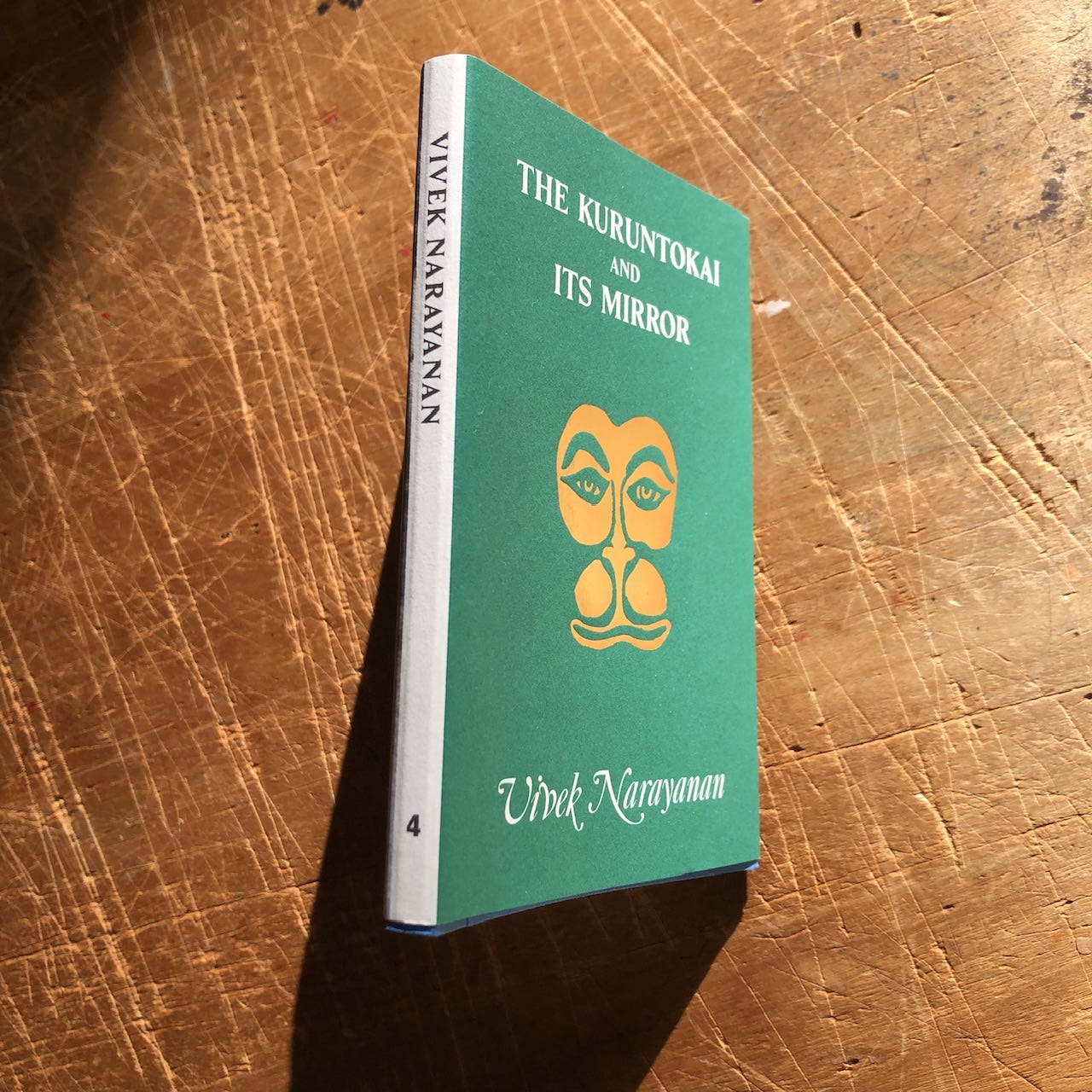
One of my favourite places to browse for new poetry is Good Press, a workers cooperative in Glasgow who run the best online bookshop I know (each item is photographed with sample pages). I found Vivek Narayanan’s The Kuruntokai and Its Mirror there, as published by Hanuman Editions, a project which, according to its website, continues
the legacy of Hanuman Books, the legendary and cult series of chapbooks that were printed in southern India and published out of the storied Chelsea Hotel in New York City between 1986 and 1993. Our books are designed as a contemporary homage to the playful kitsch and small, object-like format of the original, evoking the Hanuman Chalisa, a folk compendium of chants to the Hindu god Hanuman, sold in the bazaars of India.
The Kuruntokai and Its Mirror is “a fractalized translation and reinterpretation of a classical work in the Tamil Sangam canon, an anthology of 401 short poems composed between 100 CE and 300 CE”. After (NYRB Poets), Narayanan’s epic reworking of the Ramayana, was one of my favourite books of 2022. It’s fascinating to see him working with lyric miniatures now, translating and improvising across playing-card-sized pages on which gapped words “chank shell beads on a string”. The “close-fitting translations” are on the left-hand page, with Narayanan’s improvisations on the right. Here is a sample, with thanks to the good thumbs of Good Press:
https://goodpress.co.uk/products/the-kuruntokai-and-its-mirror-by-vivek-narayanan
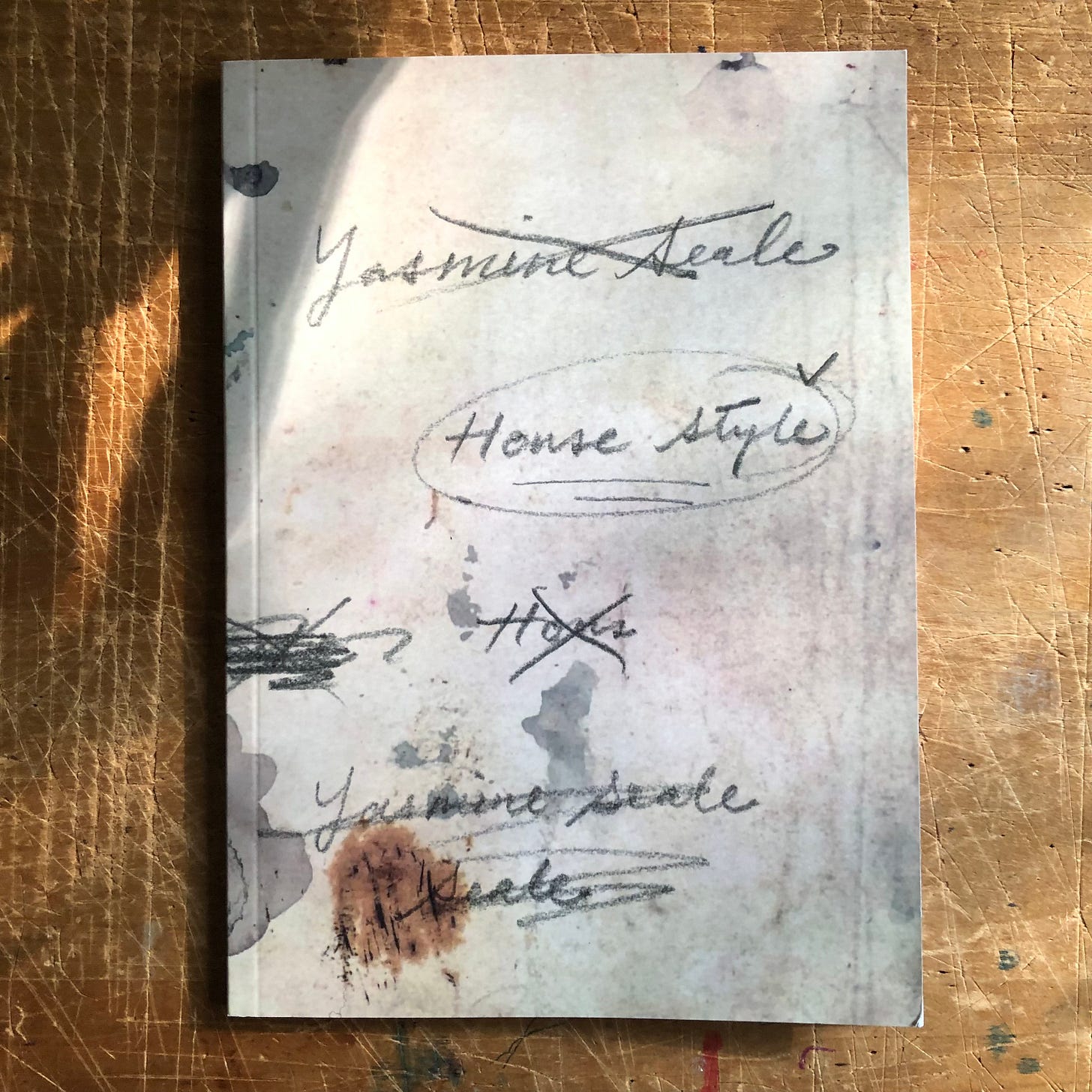
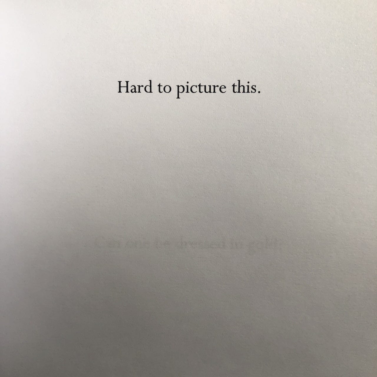
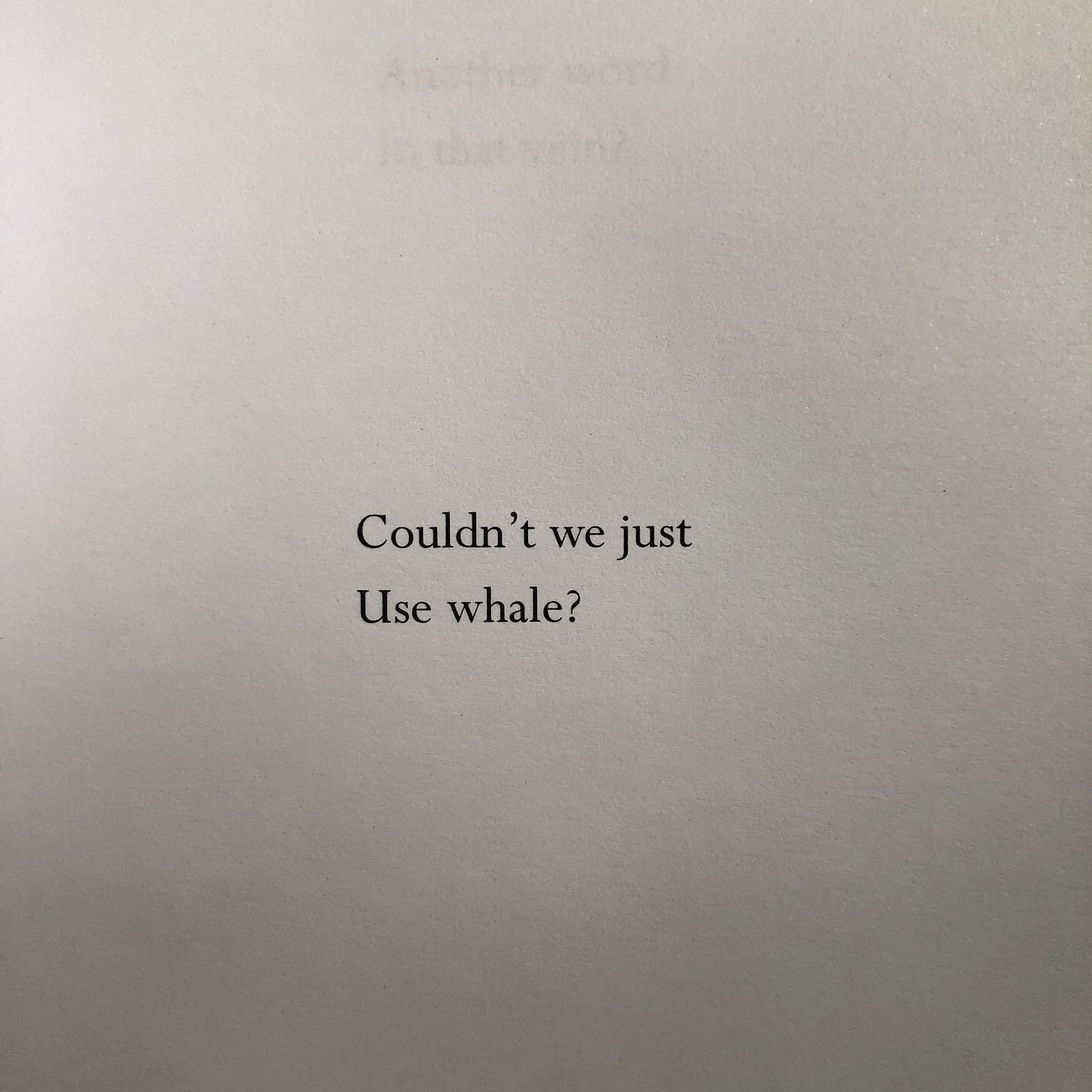
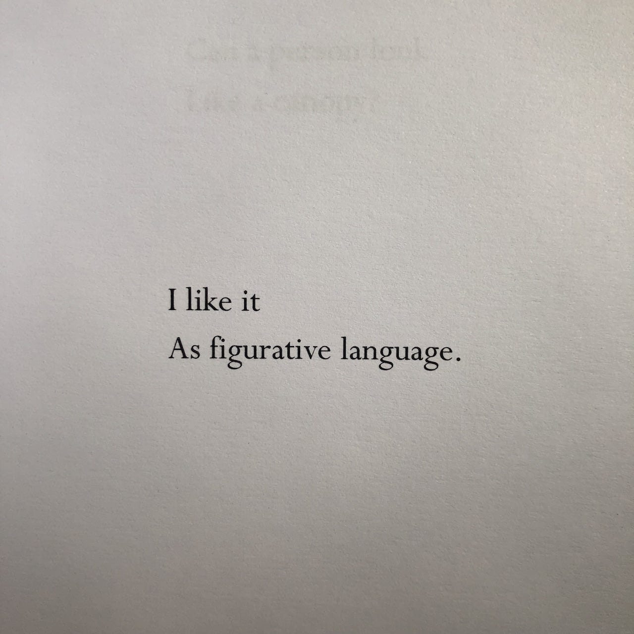
Yasmine Seale’s House Style (RunAmok) begins with an author’s note:
Some years ago, I was invited by a publisher to produce a new English translation of a collection of Arabic folk tales. At some point in the editing process, I began to see the queries that arose as a long poem, a counter-text vibrating in the margins, an effort to press the dream logic of nights into the narrative logic of (American) days.
Each query is given its own blank page, eerily disembodying the brisk professional voice that seeks to make all neat. The results read like deadpan little anti-Imagist poems: “use no superfluous word, no adjective, which does not reveal something”, wrote neat-freak Ezra Pound — here, the words reveal their own polite impatience with the subtleties of translation.
Buy House Style here: https://runamokpress.cargo.site/untitled-page
The greatest poverty is not to live
In a physical world
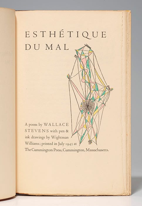
Wallace Stevens, Esthétique du Mal
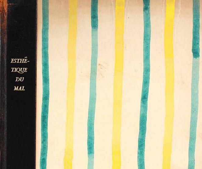
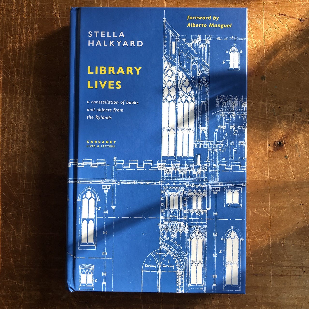
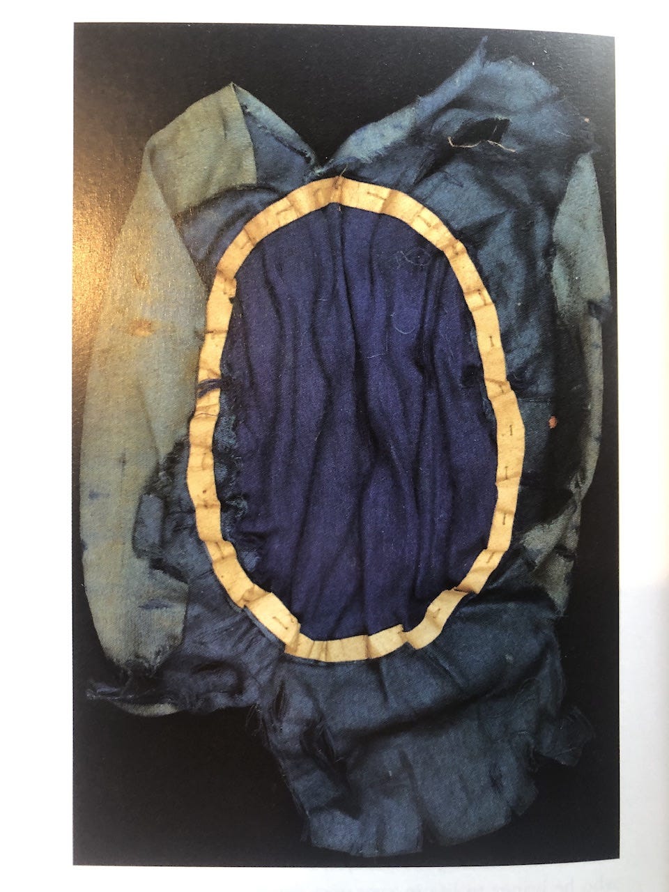
Stella Halkyard’s Library Lives (Carcanet), published last month, is almost as pleasing as a pop-up book in the way it brings objects to life. A gathering of columns that Halkyard wrote for the poetry magazine PN Review while working as an archivist at the John Rylands Library in Manchester, it’s full of stories about poets, sparked by an encounter with some material relic of their life and work (the Rylands, for example, holds the lining of Walt Whitman’s hat). One follows Wallace Stevens as he negotiates arrangements for the fine limited edition of his long poem Esthétique du Mal (1945 — pictured above) from the Cummington Press. Halkyard summarises the big questions:
The absorbency and sensitivity of different paper types; inks; the vellum backs of bindings; the limitations of kiss-printing; the value of printing images in rectangular boxes; the relationship between word and image on the page (a matter of especial significance in the case of poetry with its “uneven right-hand margin”)
Stevens says early on that he likes “bright colours” for bindings. But when Harry Duncan, the printer at the press, casually mentions that he’s looking for “a good stiff ink in dark green or purple” for the poems themselves, Stevens is not happy:
I don’t like the idea for green or purple ink in the text: in fact, I cannot even imagine purple. Green is possible, but why not black; with coloured initials? I cannot think of a decent book that I have in which the text is printed in coloured ink, and I am strongly against it […] Books in coloured inks are trivial and undignified, or so it seems to me.
Halkyard does not mention whether pop-up options were explored.
NOTES
You can buy Library Lives with 10% off from the publisher here. It’s a treat: https://www.carcanet.co.uk/cgi-bin/indexer?product=9781800174375
For more on the making of poetry books, here’s a post from earlier this year about fonts:


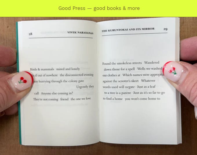

À propos ‘the way books are put together’, the Hanuman Editions book shown here seems to exhibit the common failing of any book now made in the UK: the difficulty of opening it up and letting it lie flat without the help of fingers and thumbs. The secret here is in the glue that holds together the pages or sections of pages. Up until around 1970 the glue used was almost always water-based; since then polymer adhesives have become normal in the UK printing industry, and elsewhere in the world. Water-based adhesives – familiar as the PVA adhesives used in joinery – are strong and supple and might take 24 hours to dry; the polymer/plastic adhesives are by comparison less supple but are very quick to dry. For reasons of time and therefore money, the old glues were displaced by the new plastic alternatives. The change of technics has had its effects on the design of pages: inside margins will have to be wider, to accommodate the difficulty in opening the book. So these thumb nails may look nice, but it would have been better if the digits they belong to hadn’t been needed.
Thank you — enjoyed seeing and hearing about these books, and probably especially so precisely because they're being showcased and discussed like this. Sometimes it takes someone else really paying attention, and sharing it, for one to begin to pay real attention oneself.